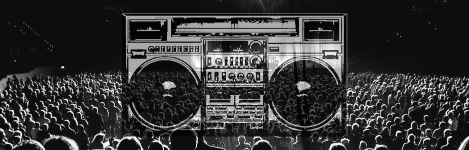
I wanted to create a header for this site that draws people in and immediately lets them know what Jersey Alternative is all about. I used images that I feel convey some of the feelings that people get from music, and images that are inherently associated with music. After playing around with four or five different ideas for a potential header, I decided to use the one you see here (which is actually the first one I made!).
I used an advanced Google Image search to find photos that were “labeled for use with modification”, that way I wouldn’t be running into any legal issues with any images I used. I wanted to use a concert photo as the background. I liked the lighting of this photo as well as its symmetry. Then I experimented using images of turntables, vinyl records, CDs, and cassettes, but in the end I decided to use the boombox graphic. It uses the same black and white color scheme as the crowd photo, but at the same time it still stands out on its own.
When putting my two images together using Pixlr, I didn’t want the end product to look forced, or like I had just copied and pasted one random image on top of another. I used three layers in the image, so that I could edit each part of the final image separately without having to delete anything or start over to make changes. I first edited the size of the photos to fit into the header space. To help the images blend into each other better, I decided to use the transparency tool and made the boombox about 65% transparency. That way, the boombox graphic doesn’t completely dominate the image – the crowd and stage are still visible through it – but anyone looking at it can still tell what it is. In the end, creating the header image was actually very simple.


